A Microbrewery Rebrand
Alpha Acid Brewing Co.
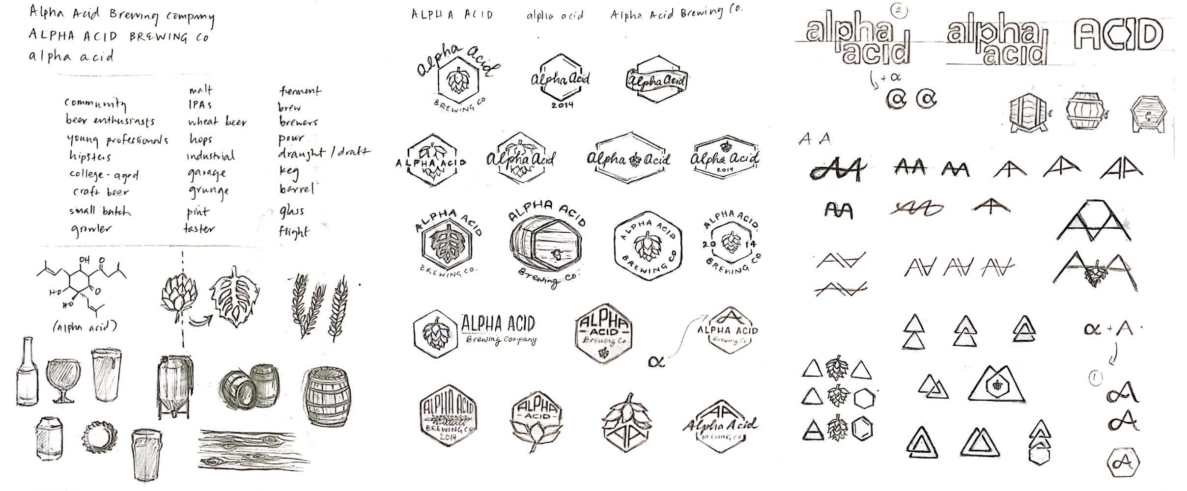
The goal of this rebrand proposal was to develop an industrial-modern logo while staying true to its humble beginning of home-brewing, and streamlining this brand identity across all touchpoints.
Their Story
Alpha Acid opened in its doors in 2014 by Kyle Bozicevic whose beer adventures began in homebrewing. The microbrewery seeks to provide a comfortable and casual beer drinking experience for their customers out of their taproom nestled in an industrial park in San Carlos, California. Since opening, they continue to grow by humble means and are gradually expanding their distribution of artisanal brews around the Bay Area and beyond.
The Existing Brand
The brewery’s name is derived from the chemical compound alpha acid—the component of the hops plant that gives beer its characteristic bitter taste. The hexagon was inspired by the compound's chemical structure but was found to be utilized inconsistently through the current brand identity.
Local Competition

The single, dark green hue conveys a sense of maturity and sophistication in perfect contrast to the weathered texture of the logomark. These elements strike the right balance of remembering the humble beginnings of home brewing where Alpha Acid began, and what it hopes to grow into as it continues to expand and mature.


