Mostly Mozart
Mostly Mozart Music Festival in New York tends to attract an older demographic of attendees and seeks to revitalize the brand with a new concept and visual identity that will appeal to a younger, more diverse crowd.
A Rebrand
Their Story
Since 1966, Mostly Mozart Music Festival has held free classical music events each summer at the Lincoln Center of the Performing Arts and other locations throughout NYC. Their new mission is to keep the tradition of Classical music alive while building new traditions. Their goal is to revitalize the Classics and appeal to a more expansive audience.
The Existing Brand
The Competitive Landscape
Brand Descriptors
Inviting
Approachable and welcoming of those who are less familiar with Classical music while welcoming back longstanding fans
Lively
A energetic and exciting presence to celebrate the shared appreciation for music
Modern
Paying tribute to the longstanding genre of Classical music while infusing it with modern sounds
Festival Theme
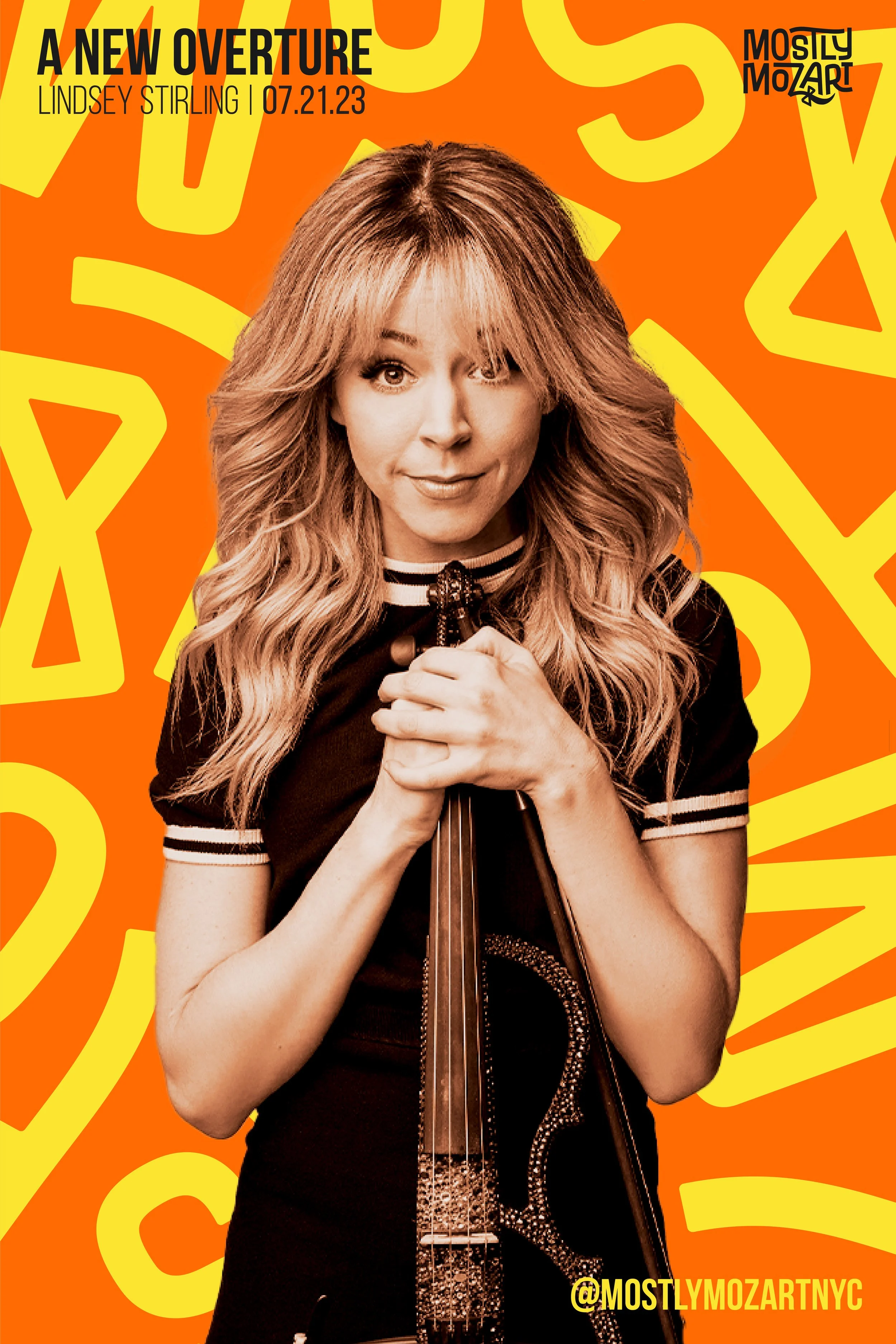
An overture is the orchestral piece at the beginning of an opera, suite, play, oratorio, or other extended composition. ‘A New Overture’ signifies a new start or a new chapter for traditional Classical music.
‘A New Overture’
Abstract shapes as the overture
(or opening) to something new
Concept 1
Concept 2
Integration and infusion of
one into another'
Concept 3
Diversity of shapes creating the whole

Letterforms fit harmoniously together, symbolic of festival attendees coming together in the joined appreciation of music.
Curved strokes and letters askew evoke rhythm and movement while breaking the norms of a traditionally rigid genre of music.
Finally, a bowtie and a tapered finishing stroke of the 'Z' pay tribute to Mozart's iconic hairstyle.
The Logo Story
Orange is the dominant color of the brand to symbolize optimism and vitality as we liven a traditionally stoic and formal genre.
The brightness and vibrancy of the brand palette brings an exciting energy to the identity.
Brand Palette
Bebas Neue compliments the blocky letterforms of the logo. It's boldness is legible on the bright and busy patterns of the brand’s identity.
typography
As the brand’s body copy, the rounded letterforms and tall x-height of Acumin Variable Concept provide an approachable presence while contrasting the blockier Bebas Neue.
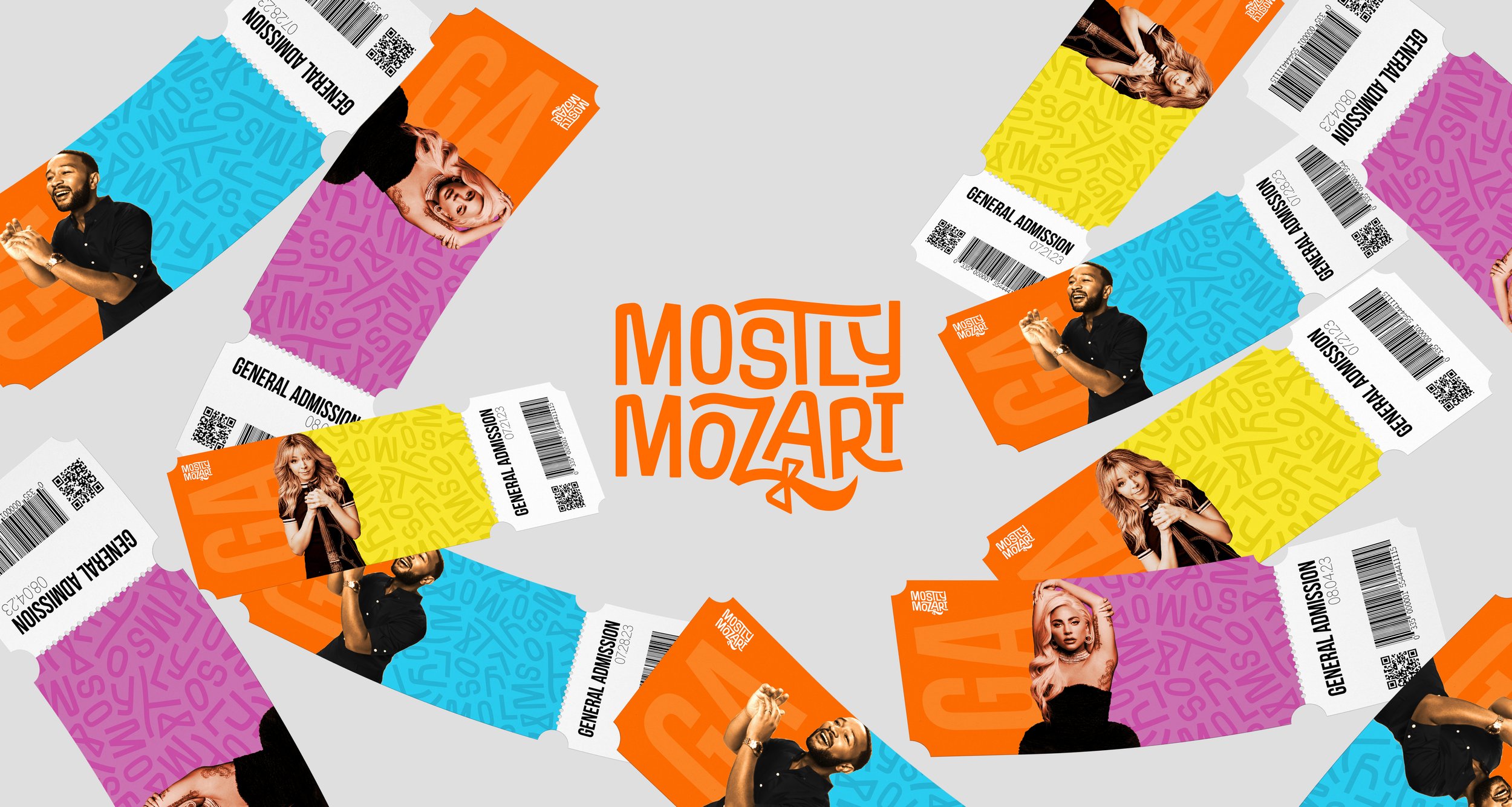
A playful brand pattern appears as confetti offering a sense of movement and evoking feeling of celebration over this modern era of classical music.
supporting graphics
‘Mozzo’ is the brand character or mascot and used as a secondary logo
The logo’s distinct ‘M’ may be used in instances where a small brand identifier is needed.


