Tycho
A Visual System
The development of a visual system for a musician to be utilized across their promotional materials of various sizes and dimensions—a promotional card, an album cover, and a poster.
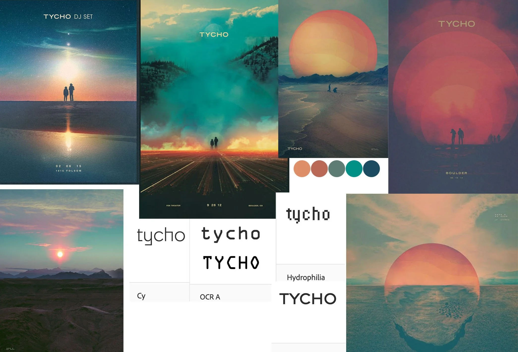
The musician's current visual identity across merchandising, promotional materials, album covers, and videography are heavily influenced by nature and geometry.
In an effort to stay true to his visual stylings, the typeface Gravesend Sans was chosen for its geometric form and modern look.
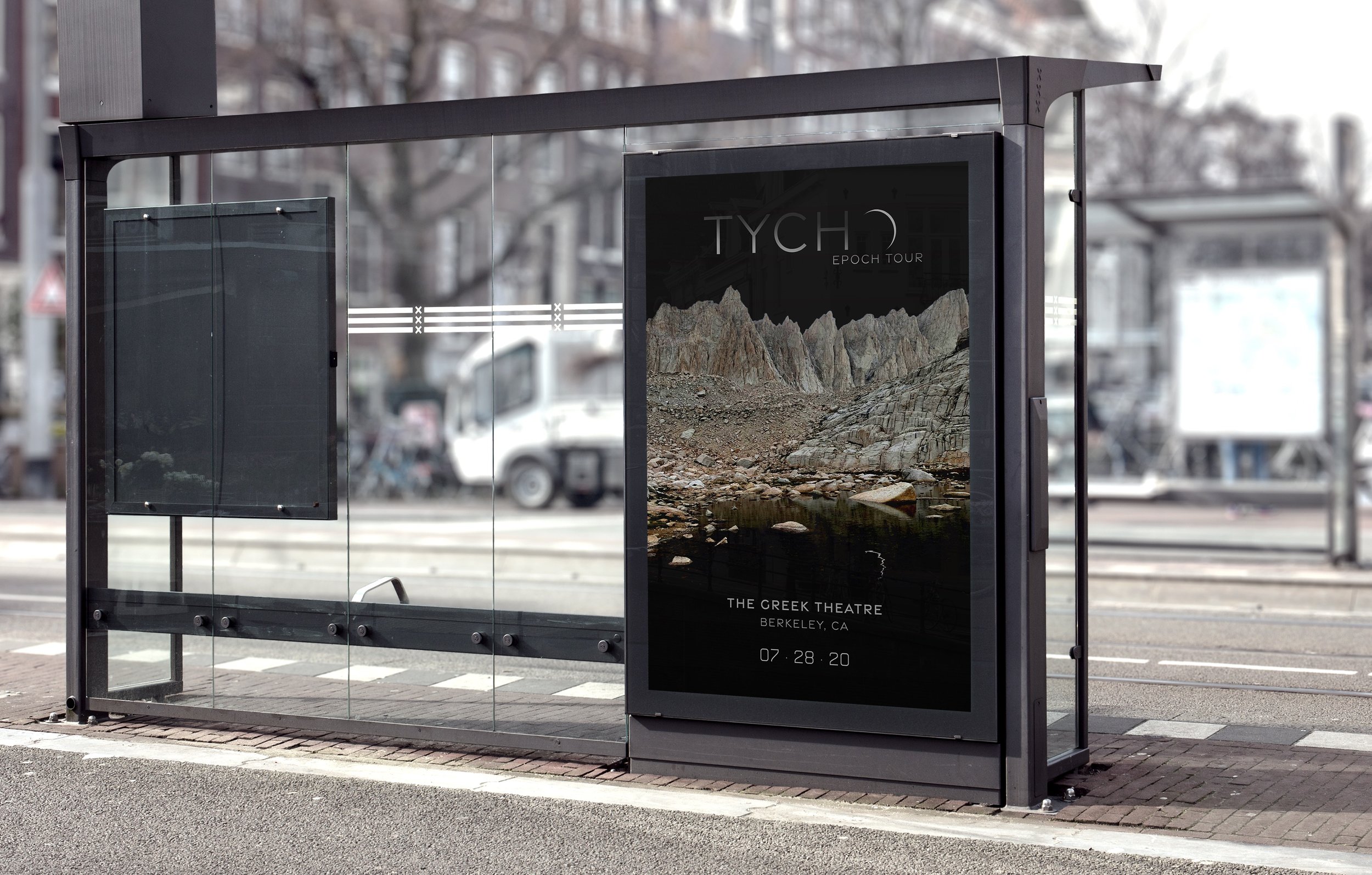
A crescent shape replaces the ‘O’ of the artist’s name to bring through Tycho’s inspiration of natural elements.
The application of a gradient gives the visual illusion of moonlit text.
Lighting and color adjustments of a photograph I had taken on a recent backpacking trip was used as the primary visual element across the system.
The promotional card features the mountain range on both sides. Following the Rule of Thirds, it occupies two-thirds of the front side framing the artist's name. It occupies the bottom third on the posterior side to accommodate the text that provide the details for the show.
A circular mask is introduced on the album cover to bring through the geometric motif that Tycho often utilizes. The crescent shape created previously is utilized as the framing element. The eye is drawn from the artist's name, clockwise through the photo and back up, creating a visual journey through the album's cover.
The mountain range is placed in the middle third serving as the focal point of the promotional poster. The alpine lake blends seamlessly into the bottom third of the poster. The crescent of the artist's name is reflected into the lake to unify the type with the imagery.


