Maid Sharks
Visual Identity
A visual identity crafted for Maid Sharks, a residential and commercial cleaning service based in Gloucester, VA.
The goals of the rebrand were to develop an approachable and modern logo and visual identity. Improving the recognizability of the brand through these visual elements would help position the small, family-owned company as a go-to cleaning service in the areas they serve.

With its rounded corners and geometric curves, the sans serif logotype presents Maid Sharks as a friendly and approachable neighborhood service. The silhouette of a shark fin occupies the negative space within the letter 'h' . While this visual statement is subtle, it creatively ties back to the company's name while making the type unique to this brand.
the logo story
A logotype and emblem allow for flexibility across brand materials, with the ability of the logotype to occupy horizontal spaces and the emblem to function on smaller areas.
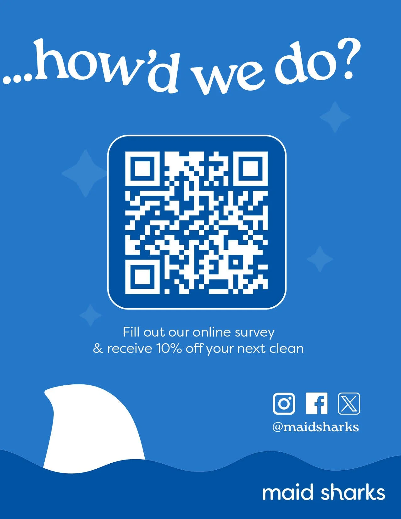
With home cleaning services making up a significant portion of business, an unwavering sense of trust is an essential brand value. The two-toned color palette of light and dark blues evokes trustworthiness while symbolizing freshness and cleanliness.
The clean, geometric sans serif was the typeface used for the logotype before manipulation of the letter ‘h’. It will be used across brand material working in contrast with the serif typeface Roca.
The serif typeface lends a professional elegance, while their rounded nature offers a sense of approachability—perfect for the brand’s casual voice.
The brand concept incorporates elements of the company’s name and ties in values of trustworthiness—all with a modern flair. The bold color palette and emblem give the brand a strong presence while strategically utilizing a casual tone for the brand voice. This strikes the perfect balance between confidence and approachability—a brand that is trusted and professional as much as it is friendly and relatable.


